FONT #1 Primary font

FONT #2 Primary font
Font #3 Secondary font


Design Approach
Brand Identity:
Conceptual Foundation: Dyone's brand identity is rooted in a thoughtful conceptualisation process. Extensive research on gemstone and silver jewellery aesthetics informed the creation of a brand that epitomises timeless elegance.
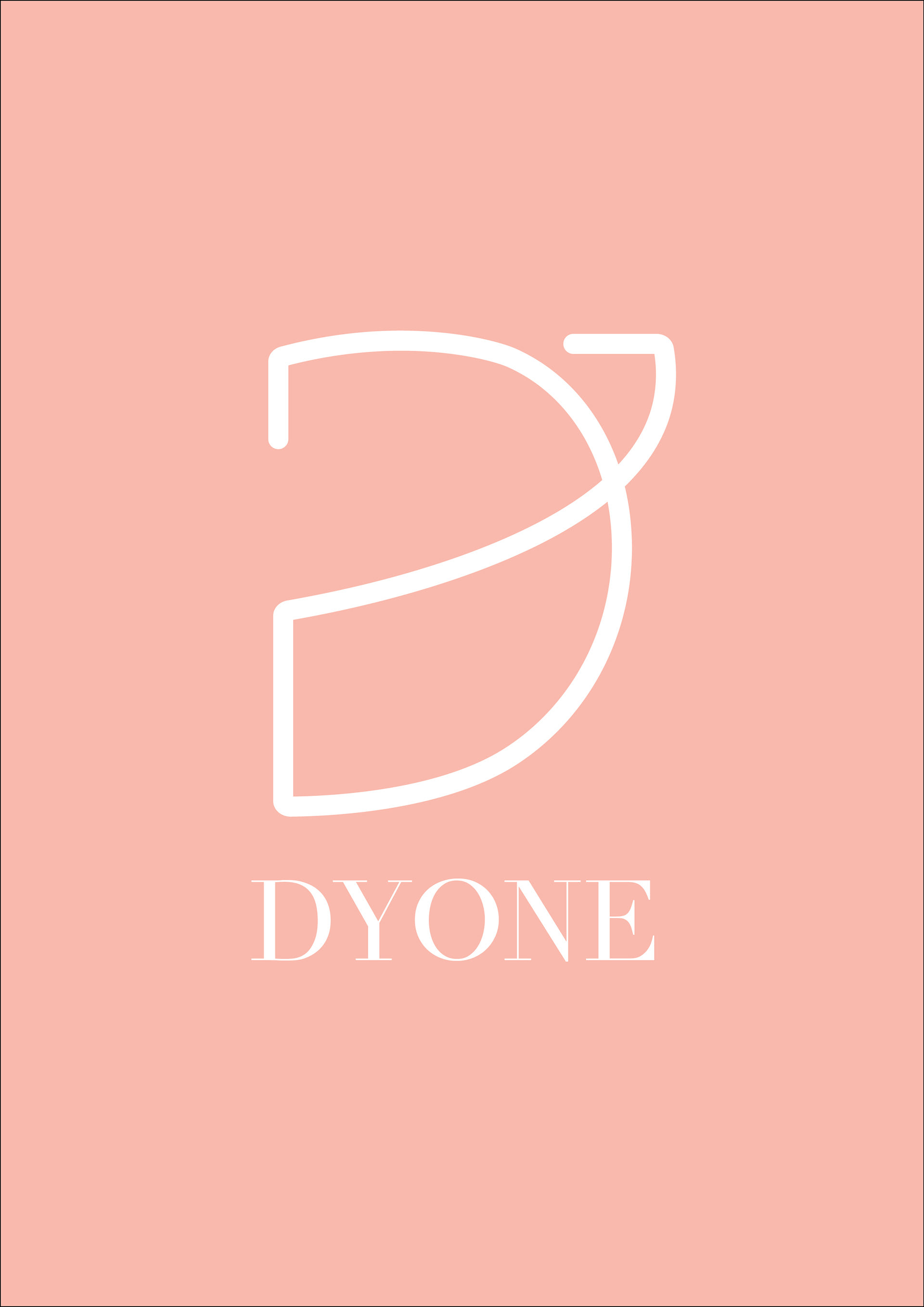
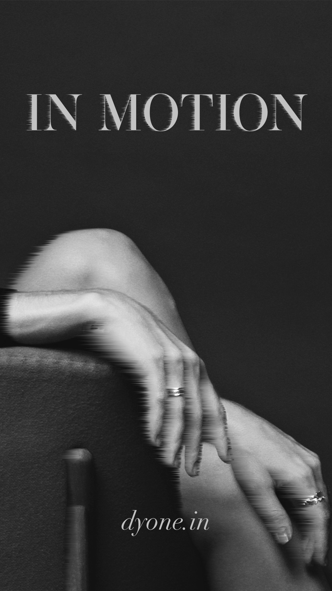
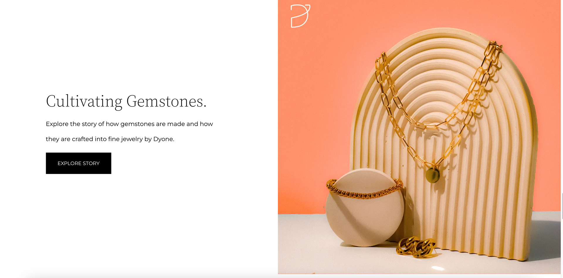
Logo Design Precision: The logo serves as the cornerstone of Dyone's identity. The design process involved meticulous precision—balancing simplicity with symbolism. The interplay of the melon and cream eggshell white hues was chosen to evoke sophistication and warmth.
Typography Selection: Typography was carefully selected to complement the brand's aesthetic. Clean and elegant fonts were chosen for consistency across various brand assets, fostering a sense of cohesion and professionalism.
Color Palette Conceptualisation:
Melon and Cream Eggshell White Harmony: The chosen colour palette of melon and cream eggshell white was not arbitrary. Melon exudes vibrancy and modernity, while cream eggshell white adds a touch of classic elegance. The harmonious blend signifies the balance between contemporary style and timeless beauty.
Emotional Resonance: The colours were chosen not only for their visual appeal but also for the emotional resonance they evoke. Melon represents creativity and passion, while cream eggshell white symbolises purity and sophistication, aligning seamlessly with Dyone's brand values.
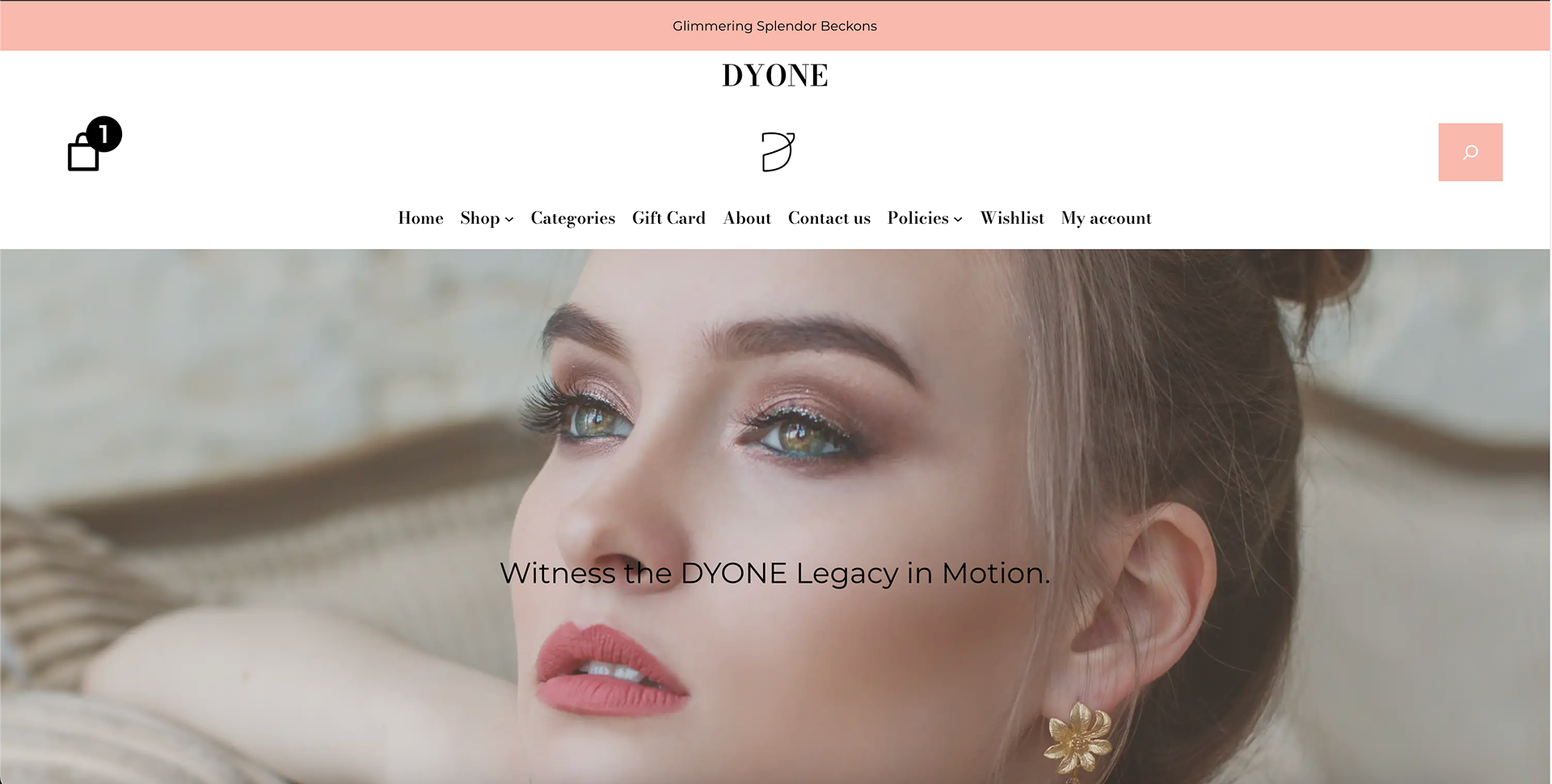
Web Design Excellence:
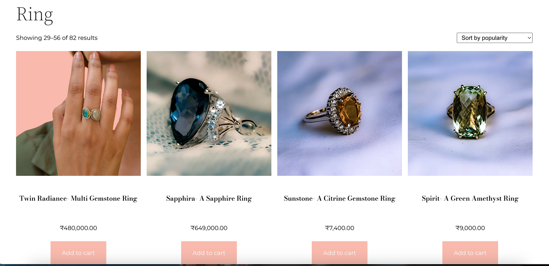
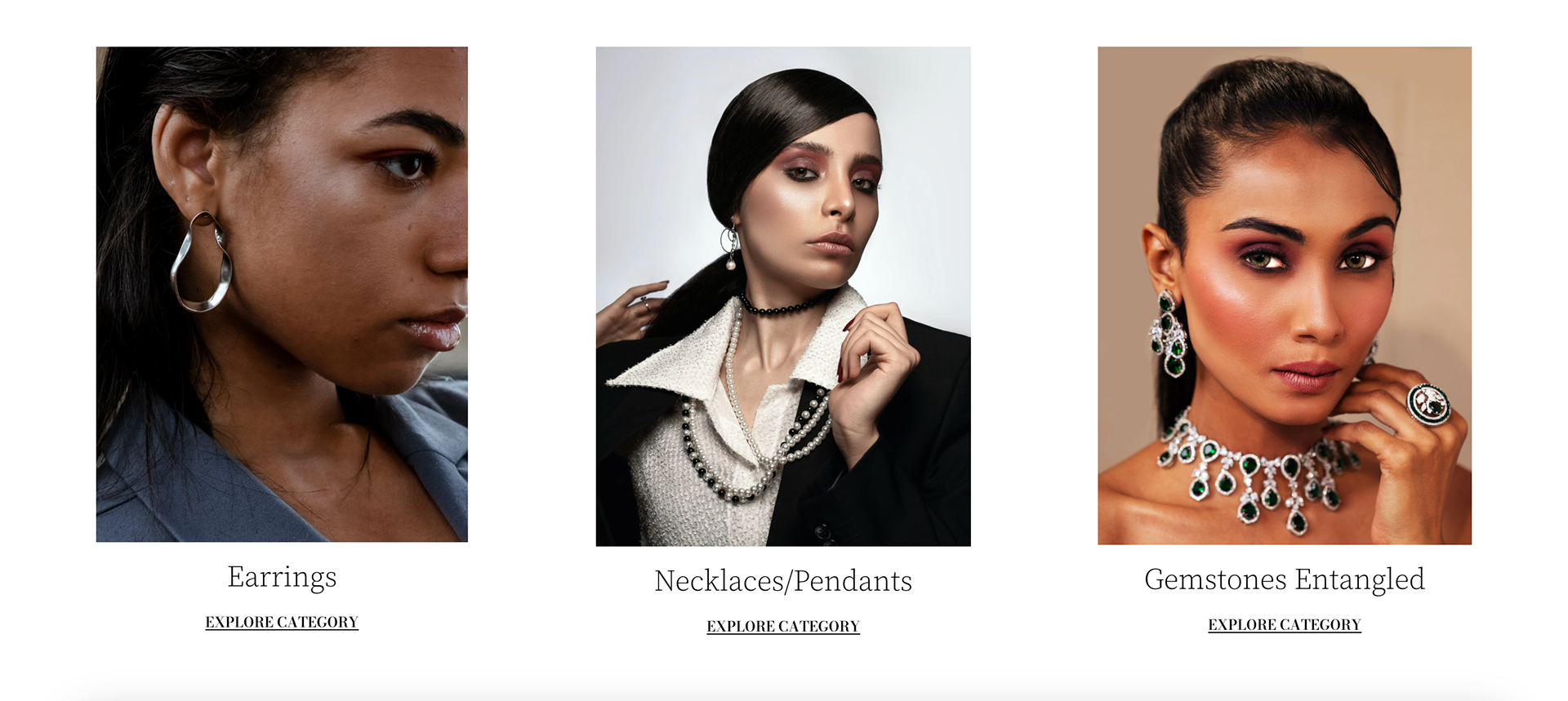
User-Centric Interface: The website design was crafted with a user-centric approach. Intuitive navigation, clear product showcases, and an uncluttered layout contribute to a seamless and enjoyable user experience.
Mobile Responsiveness: Recognising the importance of accessibility, the design ensured a seamless experience across devices. Mobile responsiveness was a priority, ensuring that users can engage with Dyone's offerings effortlessly on any platform.
Instagram Aesthetics:
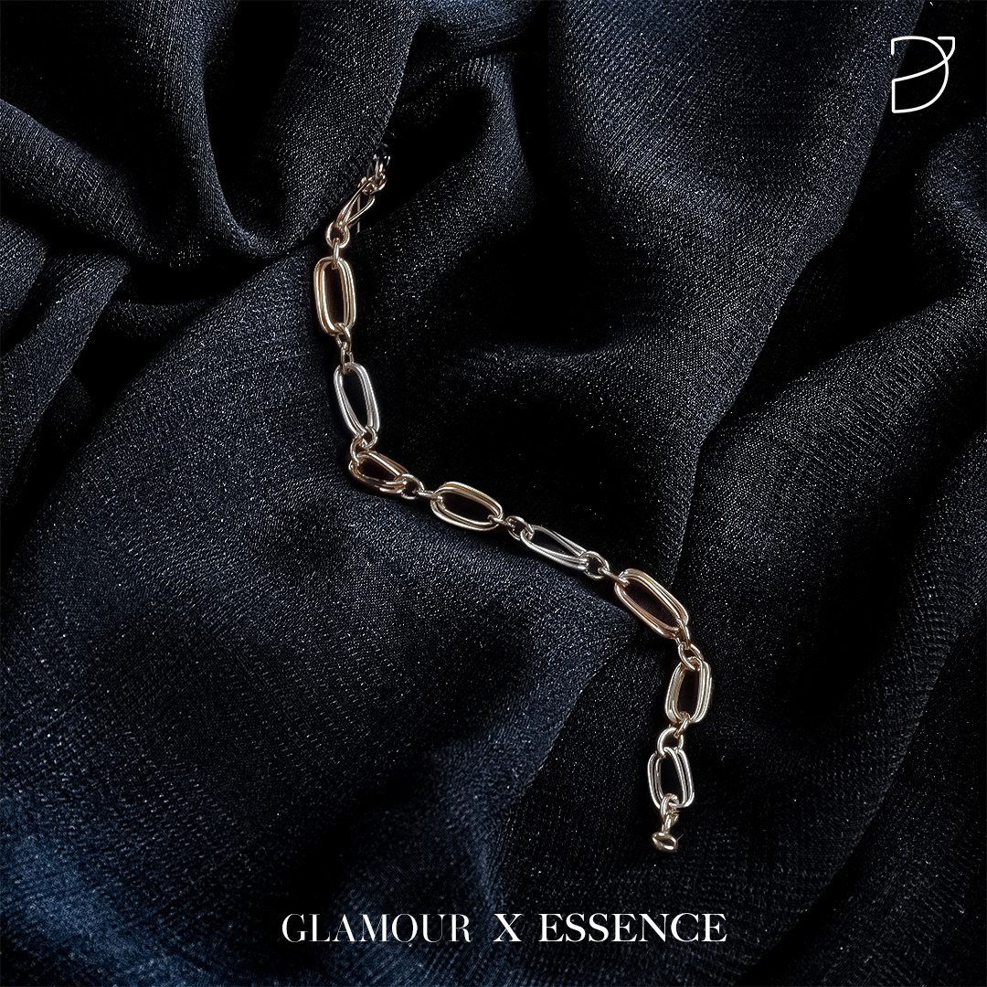
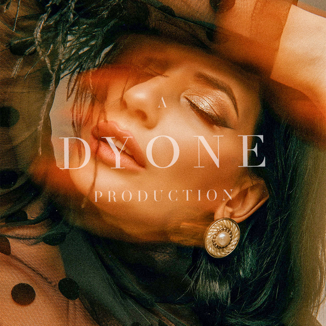
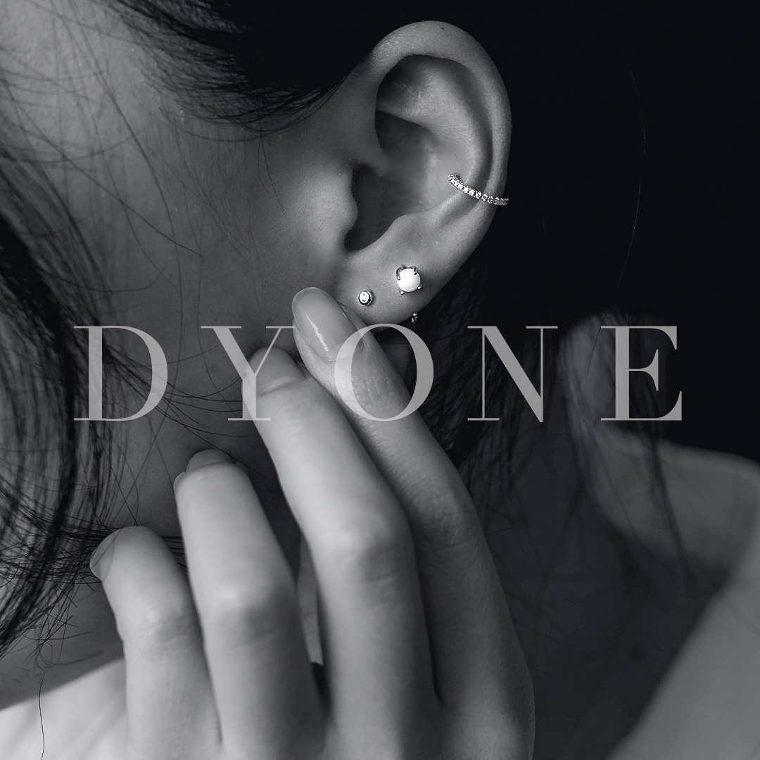
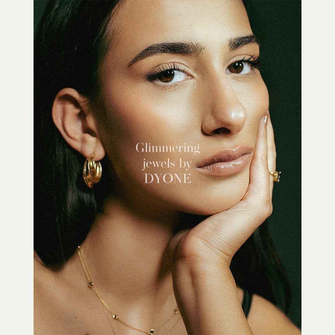
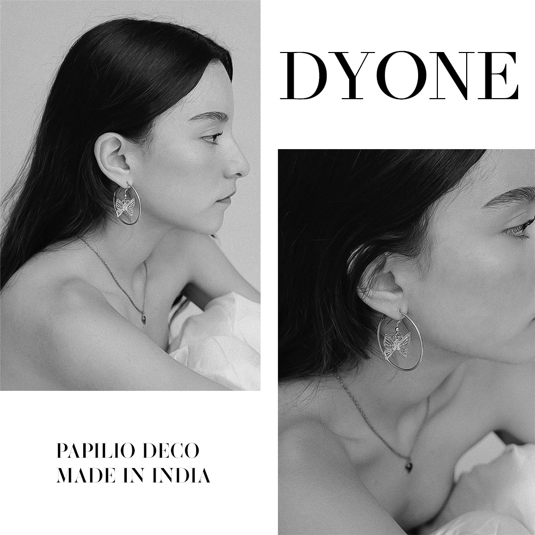
Curated Visual Story: The Instagram page serves as an extension of Dyone's brand story. Each post contributes to a curated visual narrative, showcasing not only the products but also the lifestyle and emotions associated with Dyone's jewellery.
Engagement-Driven Content: The content strategy on Instagram is designed for engagement. Thoughtful captions, user interactions, and strategic use of hashtags contribute to a dynamic online community that reflects Dyone's commitment to building lasting relationships.
Building Brand Consistency:
Guidelines and Standards: Establishing brand consistency is vital. Detailed brand guidelines were developed, outlining the proper usage of the logo, colour codes, and design elements. This ensures a cohesive and professional presentation across all touch points.
Iterative Refinement: The design approach for Dyone is iterative. Regular evaluations and refinements were made based on user feedback, industry trends, and the evolving brand narrative, ensuring that Dyone's visual identity remains relevant and compelling.