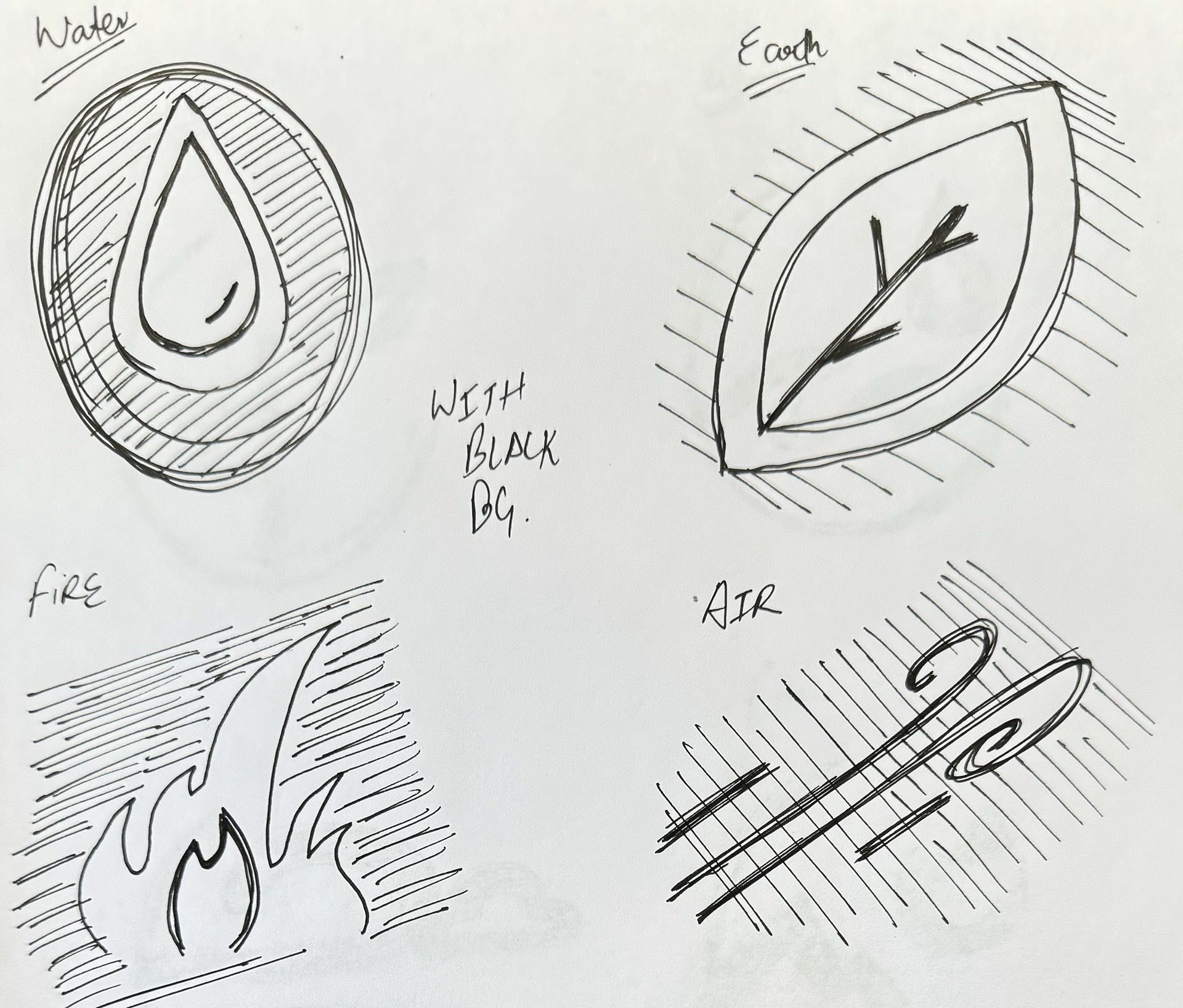

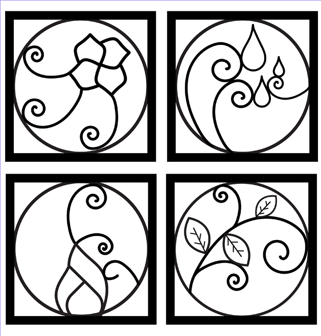
Vector trial 1

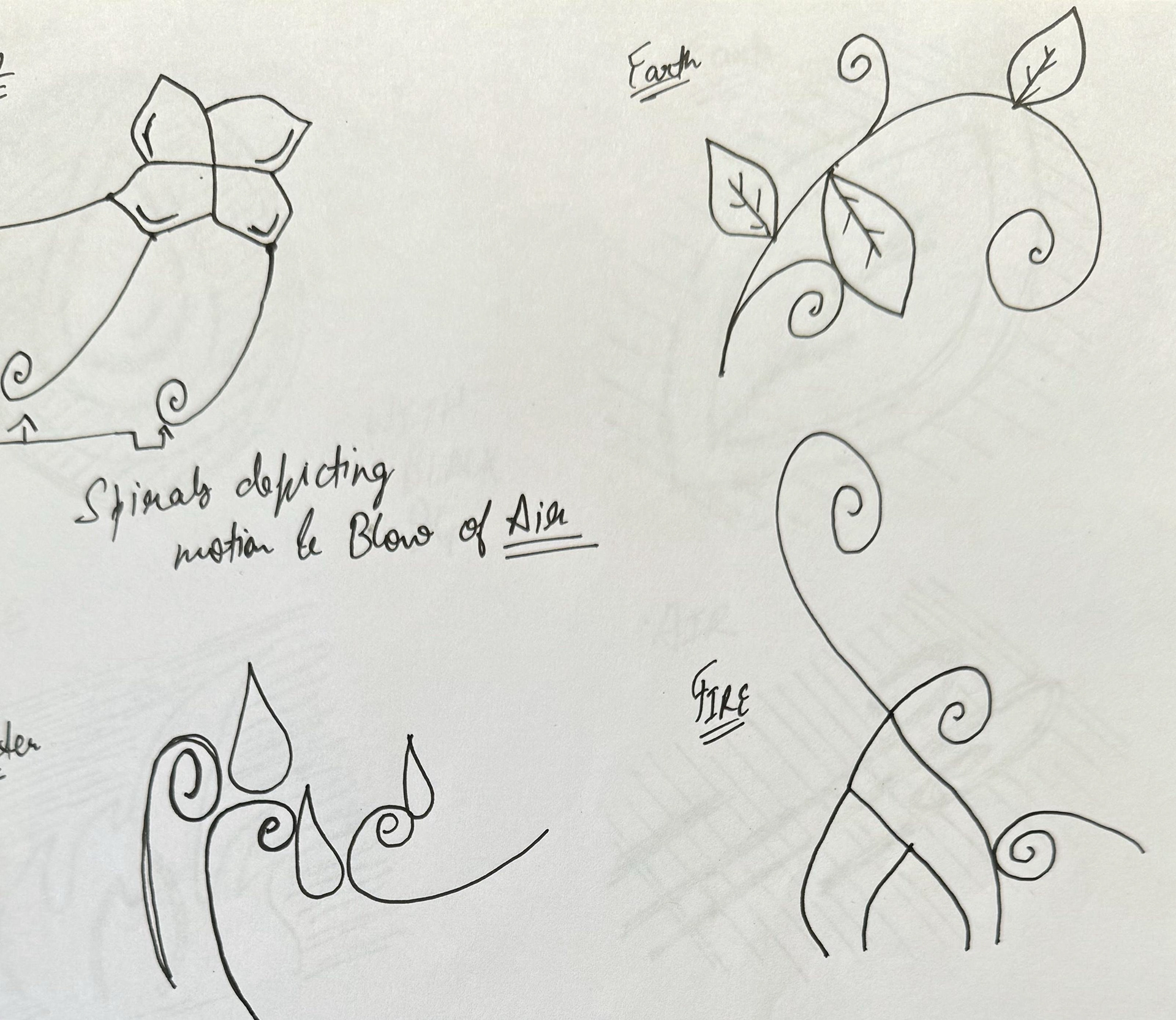
Vector trial 2

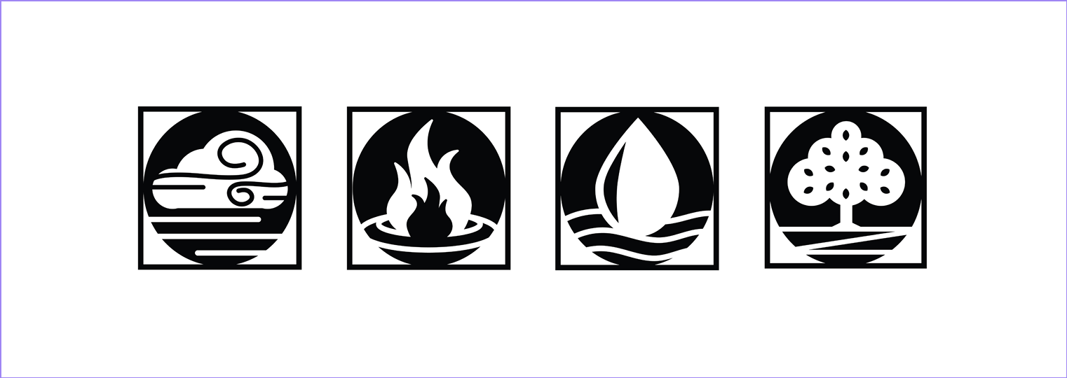
POSTCARD EXHIBIT

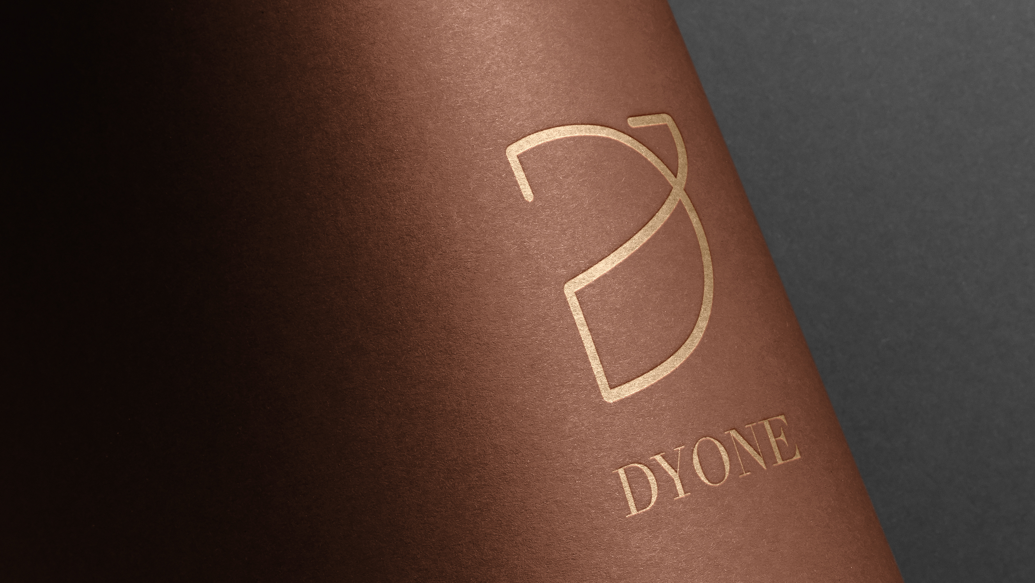
VINYAYOG ADVERTISEMENT
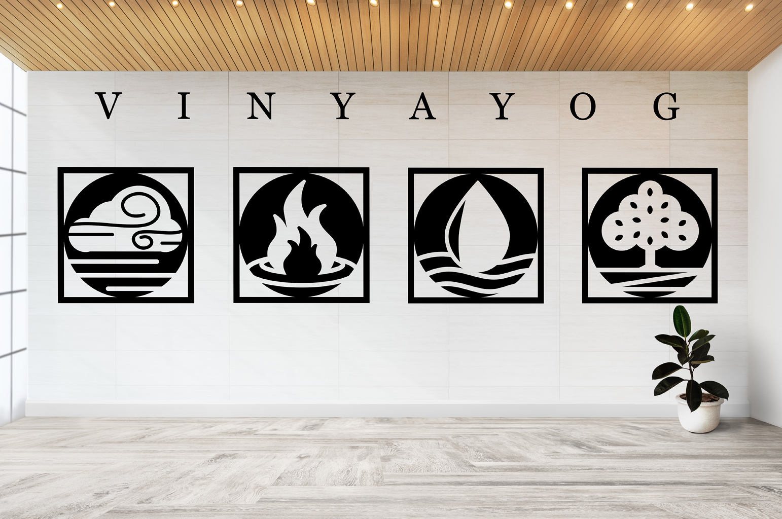
VINYAYOG STUDIO WALLPAPER
Design Approach
1. Thematic Purity: The design process commenced with a thorough exploration of each element—wind, water, earth, and fire. In maintaining thematic purity, the challenge was to distill the core attributes of each element into a visual icon that spoke to its inherent nature.
2. Minimalistic Elegance: A commitment to minimalism guided the design ethos. Each logo is a testament to the art of reduction, ensuring that only essential elements were retained to convey maximum impact. Clean lines, negative space, and precise geometry became the language through which the elemental stories were told.
3. User Experience and Accessibility: Accessibility considerations were embedded in the design process. Clarity and simplicity were prioritised to enhance the user experience, ensuring that the logos convey their message effortlessly to a diverse audience
4. Adaptability and Scalability: A forward-looking approach ensured that each logo could adapt to various contexts, from small-scale applications like business cards to larger canvases such as billboards. Scalability was a key consideration, ensuring the logos maintain their integrity and impact across diverse platforms.
5. Branding Vinyayog: Translating the elemental logos into the branding of Vinyayog was a nuanced process. Each logo was strategically placed within the brand architecture to align with the principles of balance and vitality inherent in yoga. The result is a cohesive visual identity that not only speaks to the elements but also resonates with Vinyayog's ethos.
6. Iterative Refinement: The design approach embraced an iterative refinement process. Continuous feedback loops and critical self-evaluation were integral to the evolution of the logos, ensuring that each element's representation was honed to its most potent form.